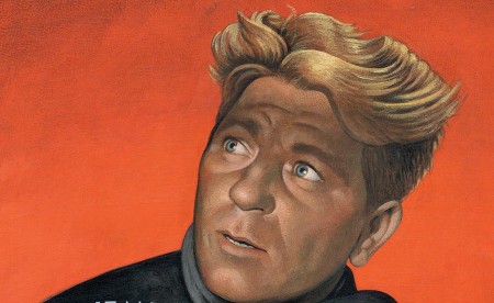
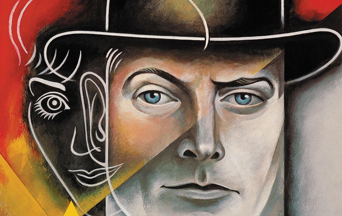
It was a nitrate negative that marshaled an august tribute for its 2012 re-release—and a movie poster of the finest design and cleanest lines to match.
The internationally acclaimed Grand Illusion—Jean Renoir’s 1937 Academy Award-nominated picture about French POWs in World War I—was seemingly lost permanently, then somehow found nearly unscathed on a shelf of the Cinémathèque of Toulouse, France, 63 years later. Considered a 20th century masterpiece, it had been spirited away by Nazi propaganda minister Joseph Goebbels in 1940 to the Third Reich’s “Reichsfilmarchiv” film archive in Berlin.
When it turned up, a fanfare arose among film buffs the world over. Screenings were scheduled; DVDs were re-issued; and renowned former Push Pin Studios collaborator and illustrator Paul Davis—the art director responsible for the New York Public Theater’s stately broadsides of the 1970s—was called to lend his vision to the film’s poster.
“I love the posters from the 1930s, 1940s, and 1950s. They were very straightforward and exciting, and had a kind of emotional quality you don’t see today,” Davis said at his New York studio this summer. “Right now, we’re in an era of so much media, it all becomes sort of mushy. So, the art most interesting to me calls on things outside of the world of commercial design.
“When an artist works in other times or brings in other influences, but focuses on the story ahead of him, that’s when I’m most moved and excited.”
A onetime boy wonder of New York’s commercial art scene, with portraits gracing the covers of Rolling Stone, Time, Look, New York, and Sports Illustrated magazines, Davis will be inducted into the Will Rogers High School Hall of Fame this November, joining such luminaries as actor and fellow illustrator Gailard Sartain—a former assistant of Davis’—S.E. Hinton, the author of the seminal Oklahoma book, The Outsiders, and musician Leon Russell.
Though an honor such as the Hall of Fame is usually reserved for those going out rather than those coming in, Davis has hardly renounced his place at the helm of modern illustration. Instead, he simply substituted it for a quieter, introspective spot on the walls of New York’s Museum of Modern Art and a permanent exhibit in Italy’s Musei Civici Vicenza, among others. Yet, Bruce Goldstein, the founder of art-house film distributor Rialto Pictures and repertory programming director of New York’s Film Forum, brought Davis out of the shadows and into a burgeoning film career once again, beginning with the poster he created for the Spring 2012 showing of Abel Gance’s Napoleon in the San Francisco Silent Film Festival followed by a limited-engagement viewing of Grand Illusion in New York.
“All Paul’s posters are so iconic,” Goldstein said. “Most movie posters today are just blown-up advertisements—laurel leafs, big heads, and big quotes. Paul does beautiful renderings with distinctive style; he gives almost a handmade quality to illustration that is very rare these days.
“We didn’t want our posters to be advertisements but rather enduring works of art with a real sense of humanity to them.”
Creating both posters required a bit more work than imitating the lines of Toulouse-Lautrec, however. First, Davis, who had first seen Napoleon in 1981 during a bombastic full-orchestra showing at Radio City Music Hall, then Grand Illusionyears later, watched the films over, and over, and over again. It wasn’t enough. So, he downloaded both to his computer to study them frame-by-frame. Seizing on the natural tension in the actor Albert Dieudonné’s face, Davis decided on a portrait of Dieudonné in the character of Napoleon straight away; Grand Illusion took more time.
“The creative process also has a lot to do with intention. When I set out to do something like this, I go to the material and I go as deeply as I can go, finding out what moves me and working off of that,” Davis told me. “For Grand Illusion, which is a film about French fighter pilots shot down and housed in a German prison, I wanted to get the stars (Erich von Stroheim and Jean Gabin) and then it became all about the drama—the conflict, the juxtaposition of the two sides, even they empathy they shared.”
But Davis, the son of a Methodist minister, is used to studying characters and the landscapes they inhabit. Growing up in Centrahoma, Oklahoma, a 0.2-square-mile speck of land in Coal County, near the Texas border, before his family moved to Tulsa in the 1940s, Davis decided early on that he had to “do something to fill the open landscape.” So, he picked up a pen and a brush. Between the ages of 15 and 17, Davis honed his art at Will Rogers High School under Hortense Bateholts, a graduate of Brooklyn’s Pratt Institute who introduced him to the paintings of Georgia O’Keeffe and Regionalist painters Thomas Hart Benton and John Stuart Curry.
With Benton on the brain, in 1955 Davis bid goodbye to Tulsa for New York’s School of the Visual Arts. By the time he arrived, the city was in the full throes of the beatnik era: hippies and poets, corduroy and ties, Bob Dylan and Enid’s Karen Dalton singing together at Café Wha? in the Village. And, Davis argues, its greatest period of graphic design: the era of Push Pin Studios and its agent provocateurs, Seymour Chwast and Milton Glaser.
Though de riguer to walk into a studio and ask for a portfolio viewing—or a job—Davis never thought about taking his work straight to Push Pin, ground zero for avant-garde illustration in the 1960s and ‘70s. Fortune, however, brought him into the hands of venerable artist agent Jane Lander, who in turn showed Davis’ work to Glaser and Chwast. Both noted his signature balloon-handed figures, but called them too abstract and cutting edge—even for Push Pin.
“Seymour told me to just keep drawing and get a regular job,” Davis said. He landed initially at Redbook magazine, where he got his payback.
“Andy Warhol called my boss to see if he could bring up some of his latest commercial work. My boss said, ‘No.’ Davis recalled, laughing. “The assistant art director said, ‘No.’ And I said, ‘Let’s give it a shot.’ ”
“He arrived, took skeins off the art and revealed this gold leaf—lots of gold leaf. We told him we were grateful, but the gold leaf would probably be very difficult to reproduce in a magazine. He shook hands with us and he left.
“I bet those drawings are worth two or three hundred thousand apiece right now.”
Nonetheless, during his internship at Redbook, Davis massaged his look and produced his first commissioned illustration, a pencil drawing, for the October 1959 issue of Playboy. He went back to Push Pin. Much to his surprise, Chwast voted Davis in. At 22, he started drawing as a contributing member to Push Pin.
During the mid-‘70’s, Davis also fomented a relationship with another up-and-coming endeavor: Joseph Papp’s New York Shakespeare Festival. With Papp, Davis flexed his most creative muscle, and still uses bits and pieces of drawing from his work with the festival to create some of the his most acclaimed illustrations today.
“I don’t feel like I’ve ever thrown anything away,” says Davis about the varied directions in illustration, book jacket and poster design that define a career of more than 50 years. “One of the artists I admire most is Picasso because experimentation is one of his strengths. He neither felt the need to be consistent nor to reject one method simply because he found another.”
Today, Davis runs his own freelance studio blocks away from SVA, and keeps an office in Sag Harbor, where he houses his vast museum of images—postcards, matchbook covers, book jackets, anything that catches his eye. He continues to experiment in not only paper and ink, but also with film and video. In addition to mentoring his own son, Davis has also inspired a generation of other graphic designers, most notably Christoph Niemann—best known for his New Yorker covers and his New York Times blog.
“Being able to work with Paul in his studio was an incredibly impressive chance to, for the first time in my life, see one of the greatest illustrators at work live,” said Niemann, who just released Abstract City, his own book of illustrations about New York. “Experiencing how Paul turned around one of his most gorgeous portraits, that of a famous baseball player, under a tight deadline—without losing his ease and becoming tense—was a uniquely inspiring treat.”
Though he has given up the gig as the art director for the Shakespeare Festival, Davis still contributes the occasional mural, the periodic book cover, and pro bono illustration for various arts groups, including Tulsa’s International Mayfest. More work with Rialto Pictures as well as a project on Eleanor Roosevelt and a potential illustration of the next president are in the incubator.
“A lot of people see my work and think I am old- fashioned, but I’m fine with that,” Davis said. “I just miss that thing in illustration—to see illustrations that actually say something about human beings; to see illustrations that are moving.”
“I don’t find most illustration very moving, or emotional or deeply engaging, these days. It is usually like a throwaway sentiment. But it’s just the zeitgeist of the time and that zeitgeist is cynical; it’s cautious. The zeitgeist changes however, and that’s something we can always count on.”
Originally published in This Land Vol. 3, Issue 22. Nov. 15, 2012.


